News Ripples
Problem
When people try to find news on a specific topic on the Internet, it is not only difficult to trace all of them but also almost impossible to go through the whole thread because the news articles are scattered. Moreover, it is hard to identify which piece of news people are more concerned about in a series of news events.
Solution
In this research, we focused on 3 attributes of news: time, popularity, and degree of association between articles. The project was conducted in 3 different stages using bar charts, metro maps, and interactive ripples to analyze the news data. Users can see the news events chronologically and ripples' size represents how many people concerned about the piece of news.
Role
I was responsible for data analysis, front-end development and data visualization in a team of 3 people.
Method & Tool
Method: Data Analysis, Data Visualization, Web Development
Tool: HTML, CSS, Javascript, D3.js, Python
Development
Overview
Developed the visualization system using D3.js, Python and Javascript. Used web crawler to collect articles on specific topics from the most popular news websites in Taiwan. Then analyzed the degree of association between such articles and filtered out insignificant news using python. After that, I visualized the data on a site. Presented the news events as raindrop ripples in an interactive way on the website as users can view details of the news events by clicking ripples.
Development Steps
The First Phase
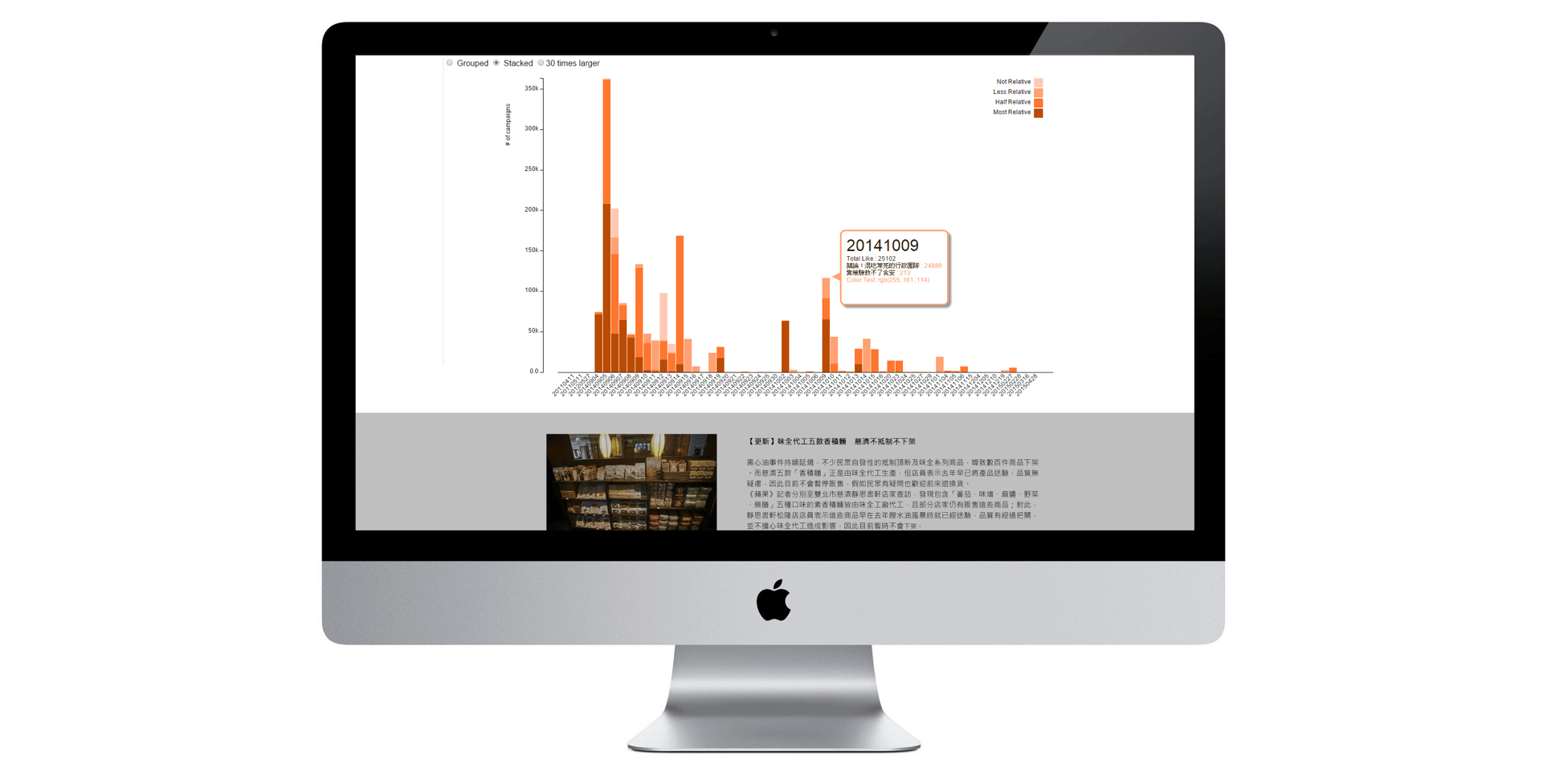
Interactive Stacked Bar Chart
In this stage, we focused on news events' time and popularity. We defined the x-axis as the time that an article was published, and y-axis as the an article’s popularity in order to observe the news events' peak. The color depth represents the degree of association toward a specific topic. The more relative to a specific topic, the deeper the color a news event displays.
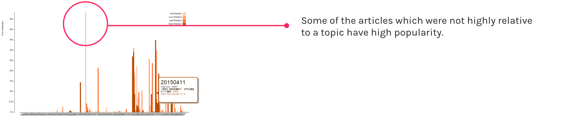
While we collected more than 500 news events, it is difficult to trace all of them and see the degree of association between articles. We also found that some of the articles which were not highly relative to a topic have high popularity; hence, we speculated that there exists a sub-branch of news.
The Second Phase
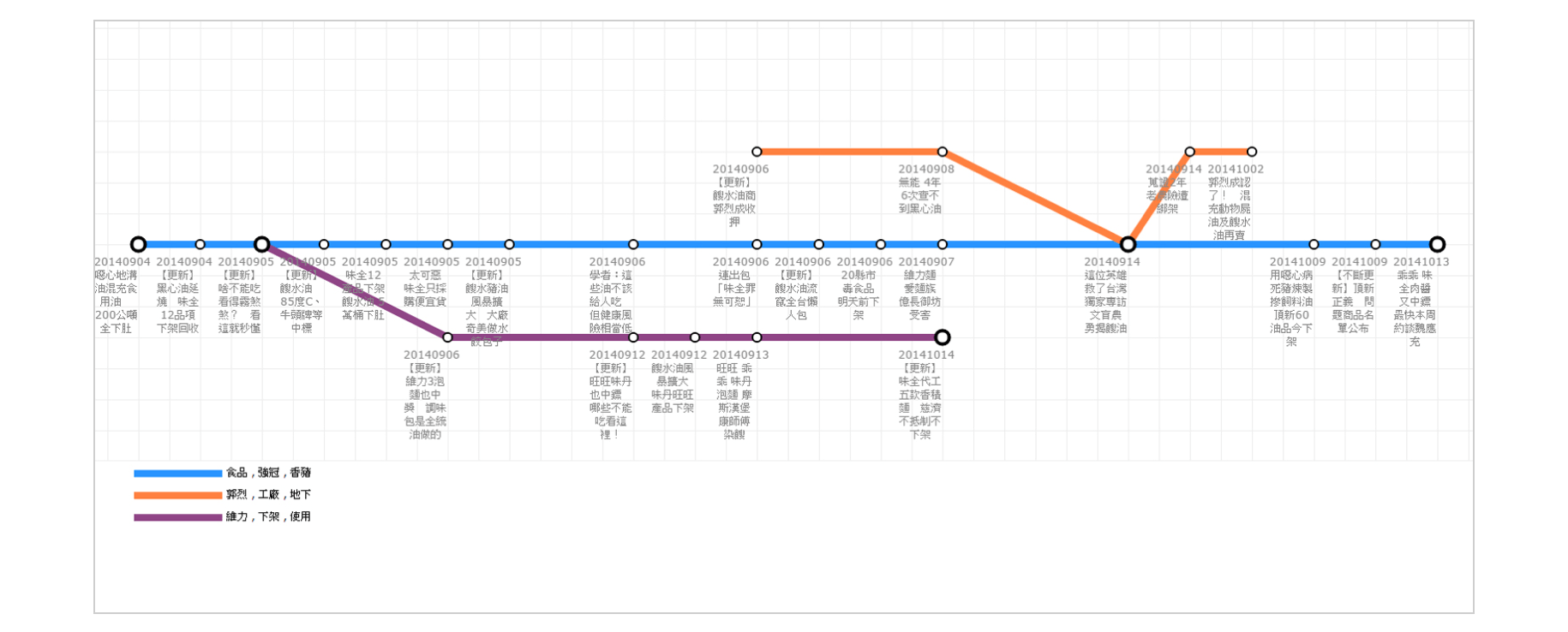
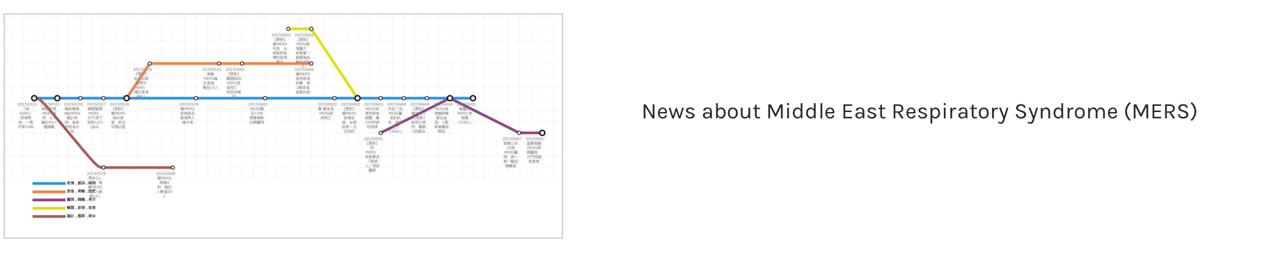
Metro Map
We used a metro map metaphor for visualizing news events because we found that the structure of a series of news events is similar to that of a Metro map. A series of news events could consist of several sub-branches while each sub-branch crosses over with the main branch at a news event. Take the piece of news, "Gutter Oil Scandal", as an example. In the series of new events, there are 1 main branch and 2 sub-branches. The blue line depicts the main branch, whereas the orange line represents news about unethical companies that produced gutter oil, and the purple line concerned pulling gutter oil products from shelves. Each node represents a news article.
The Third Phase
Interactive Ripple Animated Visualization
In the third stage, I combined the visualization methods in the former stages and added animation techniques into the visualization. There are two types of visualization – linear trajectory visualization and circular trajectory visualization.
Ripple as Metaphor
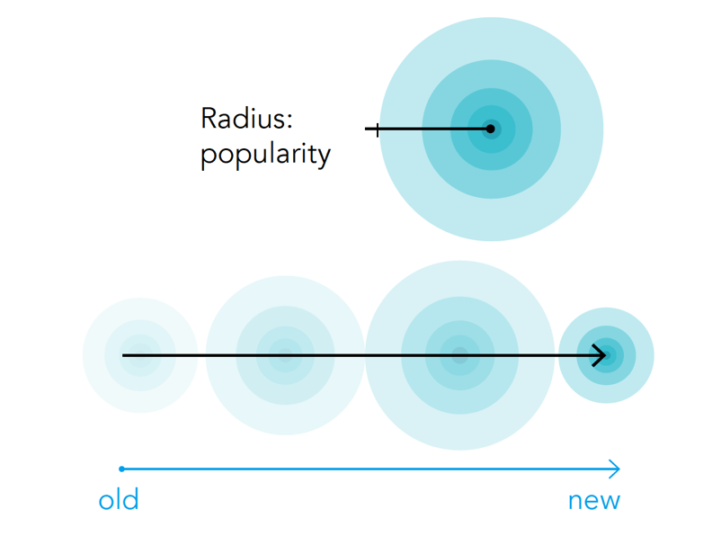
I drew an analogy between news and raindrop ripples because news is successive and continuous, which is similar to raindrop ripples. Each article is a ripple and news events display ripple animation chronologically. The ripples leave hollow circles after showing.
The size of ripples represent each news article's popularity. Ripple colors symbolize news event's branch.
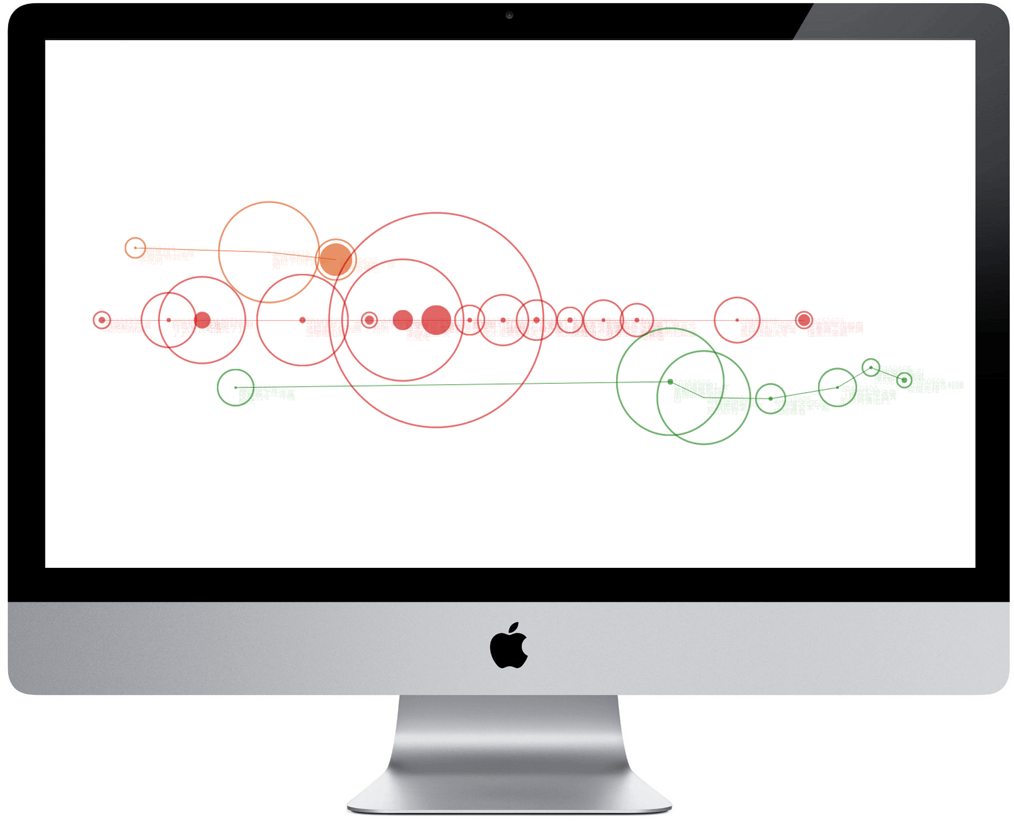
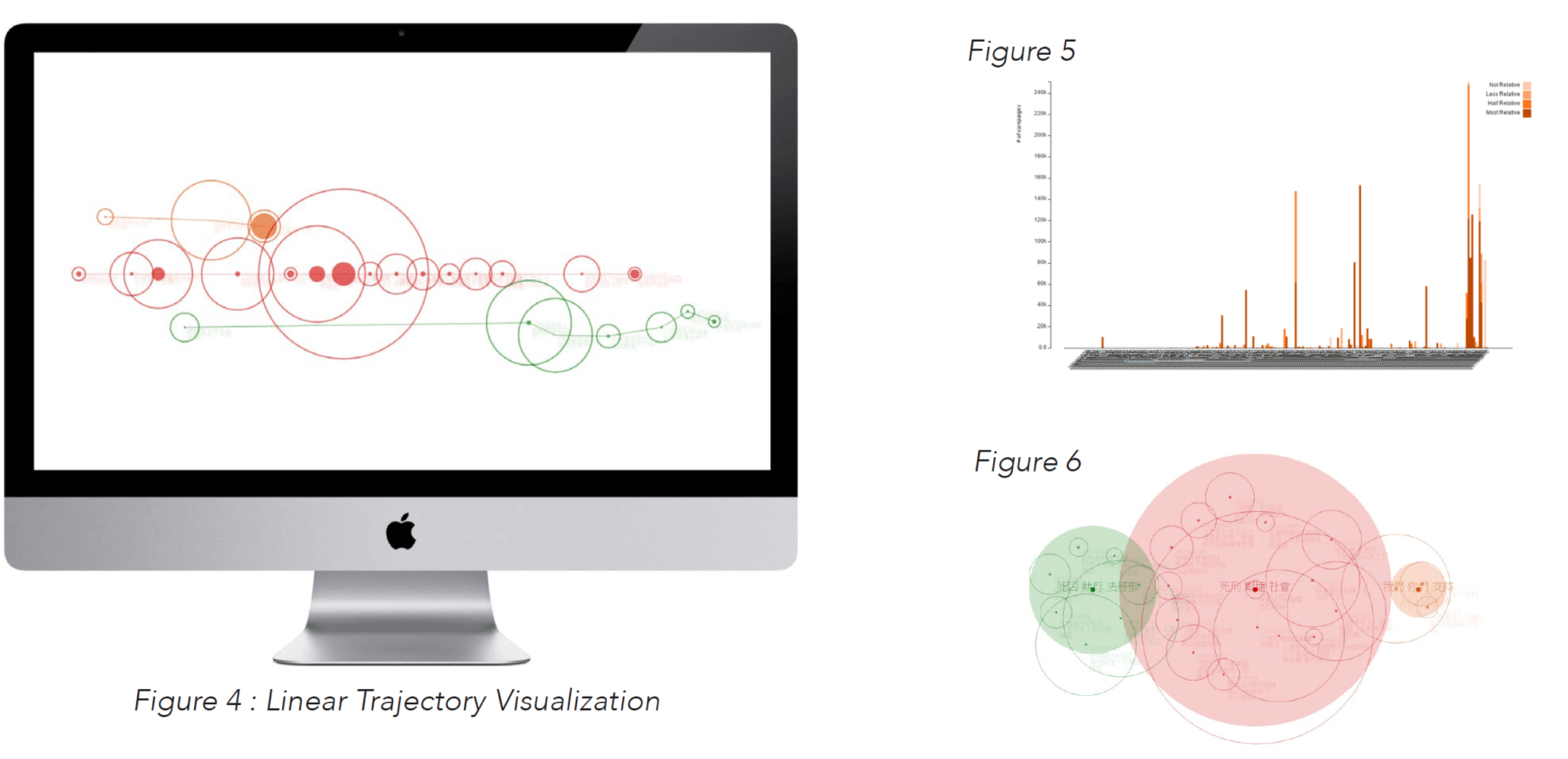
Linear Trajectory Visualization
Focus on Time
It is a time-oriented visualization. The x-axis symbolizes news events' chronological order, and ripples show up from left to right (Figure 0.1). The red line in the picture is the main branch and the orange and green lines are sub-branches.
Demo Video
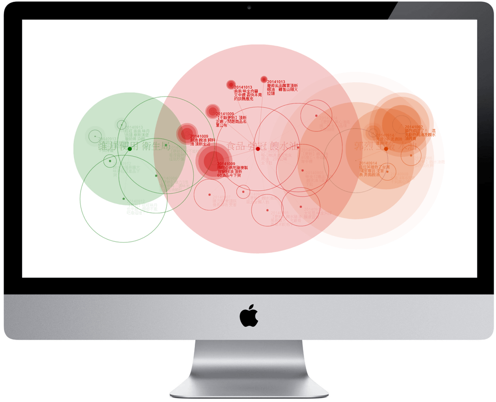
Circular Trajectory Visualization
Focus on Degree of Association
The large, filled circles in the background contain each branch's topic(keywords), and the size of the large circles are proportional to number of events in the branch. The distance between each ripple to the large, filled circle 's center represents its degree of association toward a news topic. All ripples show up around the center of large circle (news topic) chronologically .
Demo Video
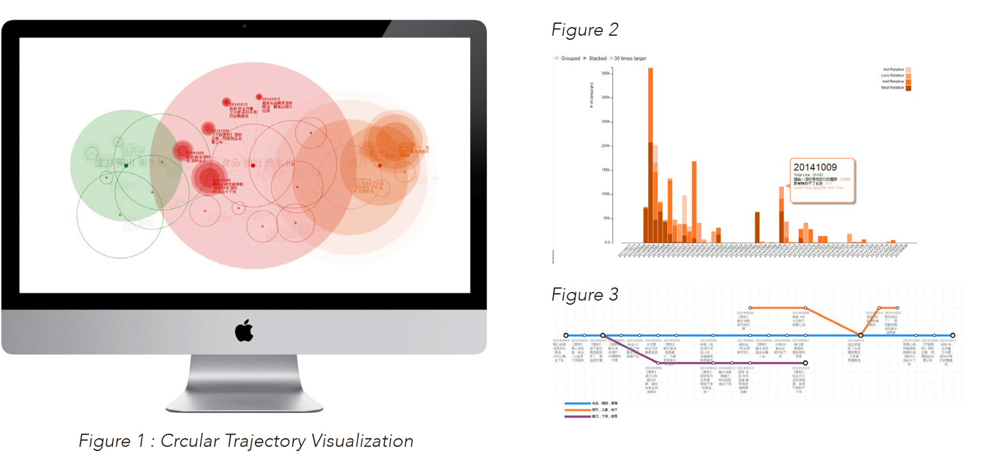
Case Study 1 : Gutter Oil Scandal
The Gutter Oil scandal refers to a series of food safety incidents that took place in Taiwan in 2014. In Figure 2, we can see that the incidents first came to light in September, 2014, and then more and more people became concerned about the incidents. In Figure 3, we can see that the news has three news branches. In Figure1, the circular trajectory visualization method combines the advantages from the two former visualizations, presenting three news topics, popularity of each article, and each article’s degree of association towards the news topic.
Case Study 2 : Death Penalty
Death Penalty has been a controversial issue for more than 10 years in Taiwan. In Figures 4 and 5, we can see that it has recently gained even more attention. In Figure 6, we can see that there are three topics – death penalty(red), implementation of death penalty(green circle), and abolition of death penalty(organge circle).